top of page
Lucy is an integrated data application platform for the American Express ecosystem, providing developers with data and application abstractions to simplify product development effort while satisfying complex enterprise requirements.
Data Application


Intro
Role and Responsibilities
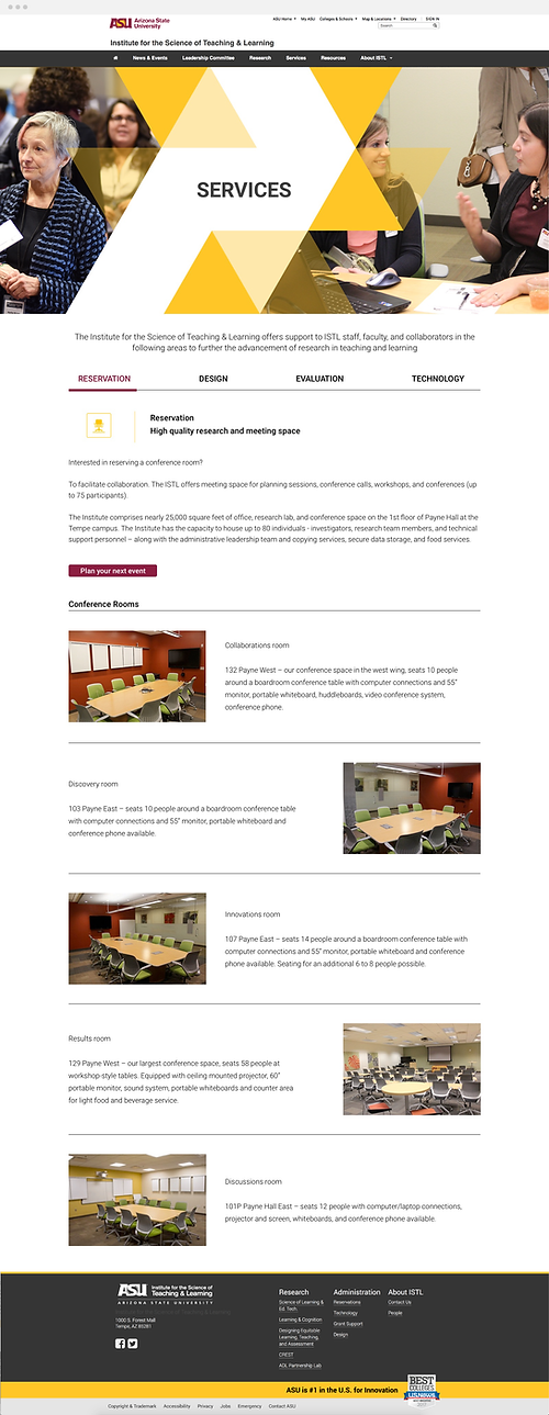
During 2016 to 2017, I was the solo designer at Institute for the Science of Teaching & Learning, Arizona State University. My main responsibilities are:
-
Website Design - Design and update ISTL website while balancing the tech limitations. Make some updates and changes in CSS and HTML while needed
-
Provide Design Service for Cross-functional Teams - Work with both the in-house research lab and external research labs to create template, infographics, web banner, presentation documents, and other design service to translate research outcome into visual solutions
-
Develop and Iterate Design Ideas - Collaborate with instructional designer and font end developers to align the institute goal with technology constraints
-
Implementation Support - Partner with developers to ensure the implantation of design and provide UI assets as needed
-
Graphic Design & Branding - Design and print graphic assets such as poster, nameplate, brochure, and infographics and support for Institute's events
Design & Innovation
Before the visual
Flow & Wireframe
Since the main purpose of ISTL website is displaying information, the relationship and interaction between different screens are not very complicate. I quickly created the flow diagram on whiteboard. Then created some mid-fidelity wireframe for design reference.

Initial diagram was drew on the whiteboard. A digital diagram was created based on that draft for presenting purpose

Mid-fidelity wireframe was created to play with the layout of each screens
Following the style
To Keep ASU Branding
In order to ensure the ISTL website following the ASU brand guideline, I was also collaborating with developers and the instructional designer to be creative without composing the style guide.


Primary Color Palette
#FFFFFF
#000000
#FFC627
#8C1D40
Secondary Color Palette
#5C6670
#00A3E0
#FF7F32
#78BE20
Footer & Header


Move to the visuals
Design the Screens


Events Screens
2017 Colloquium Speaker Series


Events Screens
2nd ASU Learning Innovation Showcase


Mobile Friendly
Update Design for Mobile
In order to provide better experience for mobile users, I have also updated the design and content to make it mobile friendly as well as using grid system to ensure it is responsive.

bottom of page